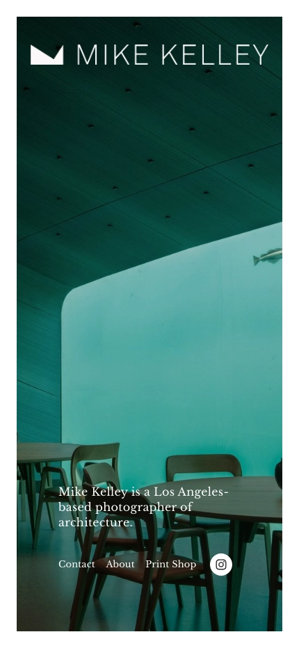
The Mike Kelley website showcases the work of Mike Kelley, a Los Angeles-based architectural photographer known for his striking images of buildings and interiors. The site serves as a portfolio, highlighting Kelley’s expertise in capturing the essence of architectural designs through his lens. Visitors can explore various galleries showcasing his projects, read about his approach to photography, and learn about the services he offers. In addition, the site includes a blog where Kelley shares insights, behind-the-scenes stories, and tips related to architectural photography.
Design-wise, the Mike Kelley site is sleek and professional, reflecting the high quality and artistic nature of his work. The layout is clean and intuitive, with a well-organized menu that allows users to easily navigate through different sections such as the portfolio, blog, and contact information. The color scheme is minimalist, using mainly black, white and shades of gray to focus on the vibrant and detailed images. The typography is modern and easy to read, with a mix of bold and regular fonts that enhance readability while maintaining a sophisticated look. High-quality imagery is at the heart of the design, with large, full-screen photos that immediately grab the viewer’s attention. Overall, the site’s design is visually appealing and user-friendly, effectively showcasing Mike Kelley’s talent and making it easy for potential clients to engage with his work.

